Friday, 16 December 2011
Thursday, 15 December 2011
Tuesday, 13 December 2011
Ancillary Billboard 2
The black background featured on this poster is to add the sinister effect, and add a darker meaning contrasting with the parody. This is also seen in the Hollyoaks fire billboard above, as the darkness creates a darker narrative.
In Photoshop, Matt B used the magic wand tool, magentic lasso tool and an eraser tool to remove the background from the orginal images.
The gradient tool was then used, dark grey and black colours were chosen for the background. The text tool was put to use to create "WHO'S THE DADDY?" again creating intertextuality with the soap magazine front cover. The logo was then inserted. The continuity error with the jumper was avoided as it has been cropped from the image.
Monday, 12 December 2011
Ancillary Billboard 1
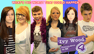
This Billboard is our first idea. I shows each characters different emotions and something about their character. The colours behind each character are different; inspiration taken from the billboards towards the bottom of this post.
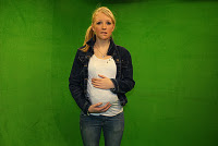
We realised that we had to use a different shot of myself (Chandelier) within the first billboard as there was a continuity error. I am seen holding the jumper that was supposed to be used as my baby bump. Within other changes and discussions within the group, Matthew Beckwith added an outer glow on the text at the top of the billboard, enabling it to stand out and depicted a narrative. It also uses intertextuality as Angel (played by Kerrianne) says within the trailer, "anything can happen in Ivywood"
These images were swapped to ensure the baby bump was shown.
This is the second copy by Matt Beckwith:

Here you can see that the photos were manipulated in adobe photoshop. This design makes the audience aware and familiar with the cast of 'Ivywood' and follows the conventions of the E4 branding. Matt Beckwith is the most talented on photoshop, and so he removed the green screen and cropped the images to allow us to place them on backgrounds of different colours. The tape and typography was inserted afterwards.
We followed the styles that look a little bit like these, as it is aimed at a similar demographic audience, and all these have been/ are broadcased on E4.
The E4 style guide, gave us advice and the conventions on what our branding had to obey:
Ancillary- Soap Magazine, final front cover.
As previously mentioned, we took inspiration from the 'TV Easy' magazine. The use of bright colours highlight the fun within our parody and the images featured are from different soaps that have been created within our college environment.
Planned by: Matthew Beckwith, Laura McCann and Kate Trollope.
Created by: Kate Trollope
Planned by: Matthew Beckwith, Laura McCann and Kate Trollope.
Created by: Kate Trollope
Location Shots
Location shots
View more presentations from kathryntrollope.
We had to establish where we were going to film our trailer, and so we thought it appropriate to film in a area where the MES would be easy to manipulate and access was allowed at any time.
We had to establish where we were going to film our trailer, and so we thought it appropriate to film in a area where the MES would be easy to manipulate and access was allowed at any time.
Friday, 2 December 2011
Photographs: Ancillary 1 & 2
We used this image as our chosen front cover for our TV magazine because all the facial expressions and emotions are clear and the lighting highlights all of this.
This photo was rejected as our soap magazine front cover as the characters are too far away from each other, therefore this would not collaborate well for the conventions of a magazine.
Each character had an individual photo taken for our first idea billboard. This consisted of all the characters making an appearance with different facial expressions, and some MES to show the characters personality. e.g. Matt B (a.k.a. Mickey) poses with a fluffy scarf to show his feminine side, which also appears within our trailer.
Matt E (a.k.a. Rhino) poses with a Rhino tattoo on his arm.
Ancillary Planning- Billboard posters
Here are some scanned pictures of our planning for our billboard posters, Ancillary Task 2. Matt Beckwith and I have drawn up two different ideas as we weren't sure which one would be more affective When planning this as a group, we all decided to create two as that then gave us a chance to COMPARE. We looked at concentrating on a billboard that built on what we were concerned as our MAIN STORYLINE and another that looked at each individual character. We have used the e4 designer website to ensure that we follow conventions. We have also taken inspiration from the Ugly Betty billboard poster.
Matt Beckwith came up with a slightly detailed drawing of our second idea. We settled on the decision of having a MCU (medium close up) of each character, thus allowing the audience to become interested in the soap before they have even seen it, as the emotions on the faced would become clear through FACIAL EXPRESSION and BODY LANGUAGE.

This is another plan for our first billboard idea, including our main storyline. This billboard includes two CU of Rhino and Mickey from the side. This shot would show the anger and hatred between the two characters as their eyes would match the same eye line. Chandelier would be seen standing in between the boys but in a MCU to highlight the love triangle storyline. Also, we would include the TWITTER REFERENCE which shows that the soap is aimed at a YOUNGER AUDIENCE, just like other programmes that are broadcasted on E4.
Subscribe to:
Comments (Atom)


